How about finding out about the changes in the renewed X-view pop-up page and learning how to use it?

If you have read the previous posting about new features of X-view analysis page and the method for use, then you would probably find this posting about the changes in the X-view pop-up page very interesting to you .😊
By the way~ If you want to experience the new features of Jennifer, upgrade it first. You can use all the features! 😘
Are you curious about how to make the best of X-View transaction analysis page?X
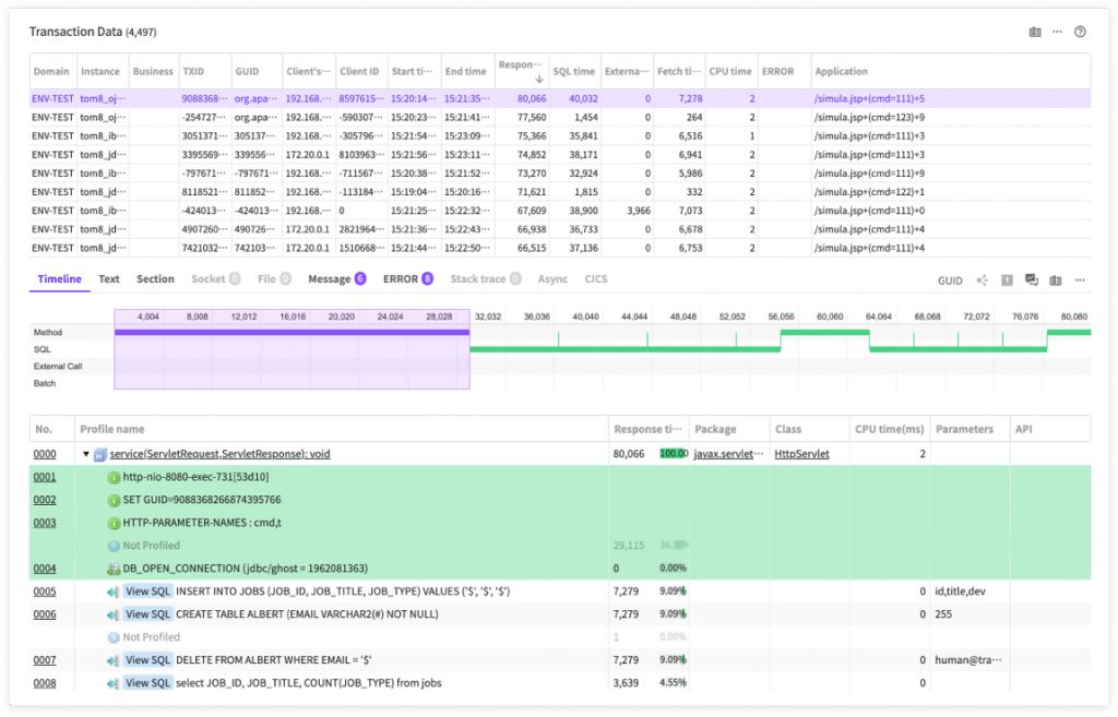
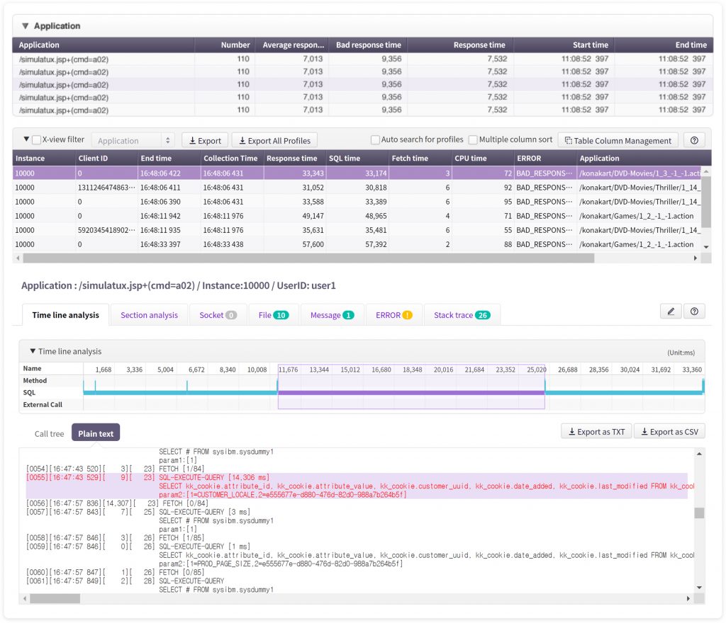
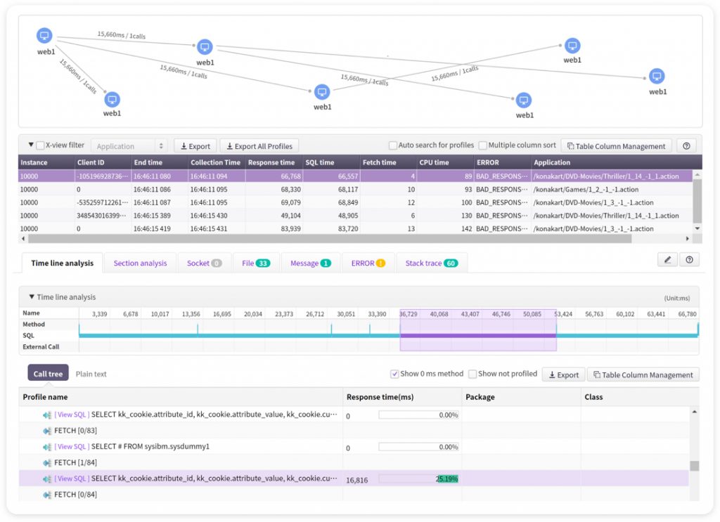
In Jennifer 5, the essence of performance data analysis is to analyze transaction profiles. It is the function most frequently used by Jennifer users and thus the complexity of the screen is that much high. In addition, it is launched as a pop-up window, so the function is required to show as much data as possible in limited areas.
However, it has been already 7 years since Jennifer 5 was officially released, and as our engineers reflected various requirements from Jennifer users to the system, after some point, it began to accumulate some inconsistency in the UX while just increasing the complexity of the screen. We had to make changes.
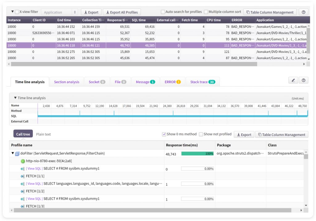
It is possible to access the X-View pop-up window from various routes. Most popular way is to drag a scatter of transactions or click in the X-view chart of the dashboard or analysis menu.
In fact, most of data in JENNIFER 5 is concluded as a transaction. For instance, if we assume that a user-defined event occurs, then there exists relevant transaction data in it. In addition, if an error defined in Jennifer occurs in a user’s application, then there exists relevant transaction data as well. In fact, simple transactions do not matter that much.
What is the concept of transaction grouping?
JENNIFER 5 supports the concept of grouping these transactions for displaying them accordingly. For example, you can use GUID, client ID, application, user ID, or client’s IP address to group them by relevant transactions that illustrate the transaction call relations or simply the field values.
In general conditions, the screen is divided into top/bottom vertically but that is not the case when it shows the grouped transactions mentioned earlier. At the top of the transaction list area, there will be additional areas created. In this way, the profile data viewing area is reduced in height, so Jennifer users will feel somewhat inconvenient depending on the resolution of the monitor.
So, here are the changes in the X-View pop-up window UX!
X-View pop-up screen area is fixed as top/bottom, so that users can view the profile data analysis at a wider angle. Then, here is the question. Where should we put the grouped data viewing area? The front team chose to put it as a bar chart in the left side area. In fact, grouped data is not suitable for displaying with a bar chart as there are too many field types. So, they decided to exclude and hide some field values in a bar chart unless they are very critical.
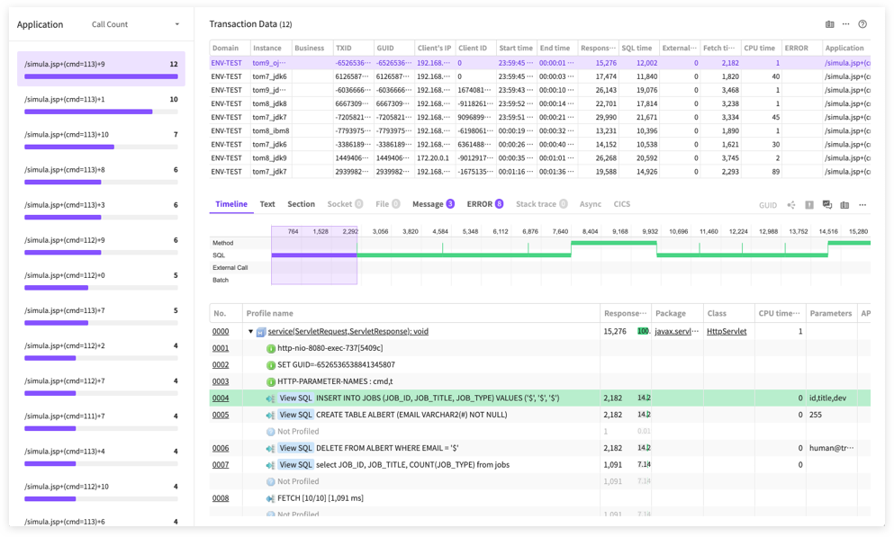
Interestingly, relevant transactions are displayed in topology charts. It was not suitable for putting it at the left side area. so they put it as a layer at the right bottom. We assigned a certain transparency level to make sure it is not highly visible before activation. If activated, the layer area is broadened.
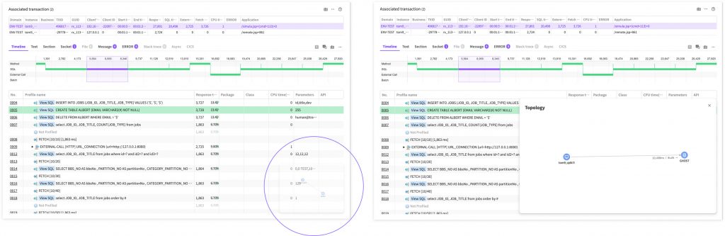
Depending on the complexity of topology charts, you can change the layer size to view the topology chart on a wider screen.
What are other improvement points?
- Features with less importance are grouped in one button.
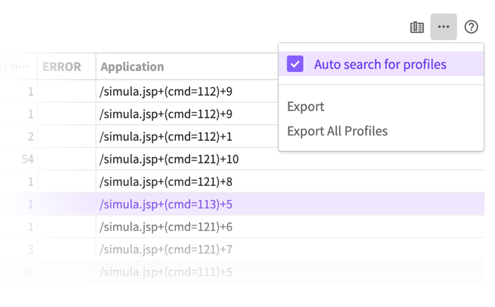
2. If a feature is available but cannot be used at present, then it is deactivated before being displayed. By opening the hidden features, the user can see there are various features.

Use the improved features this way!
JENNIFER users are now able to use the X-view pop-up window that is more consistently arranged. As there is much more free space at the bottom, Jennifer users can more easily analyze the profile.
It might look trivial in some ways, but the analysis screen is most frequently used, so it was a tough choice to make big changes. But we tried hard to come up with a solution that can satisfy everyone. This year again, the front team will continue to make meaningful changes. Please, look forward to the next Jennifer re-design article to be released later.
