How about finding out about the recently renewed Jennifer navigation, menu lists, and alarm functions?

Jennifer version 5.6.0 has been released.
The biggest change in the version is in the Jennifer main screen. I think it must be the biggest change that many of JENNIFER users would experience by themselves.
Starting with somewhat trivial issues of UI/UX, and covering even improvements of the overall layout and experimental functions that have never been tried before, let’s discuss the new JENNIFER layout briefly~ 😘
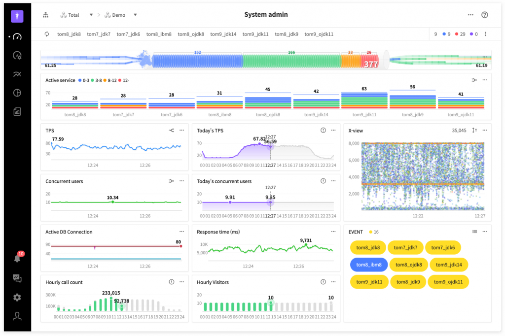
New navigation, it is wider and more refreshing!
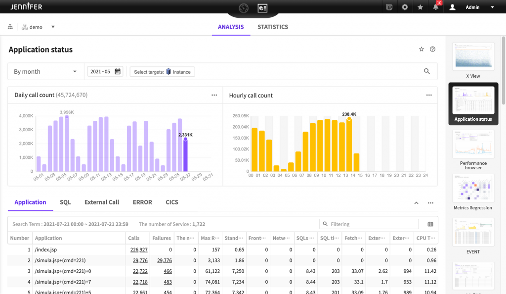
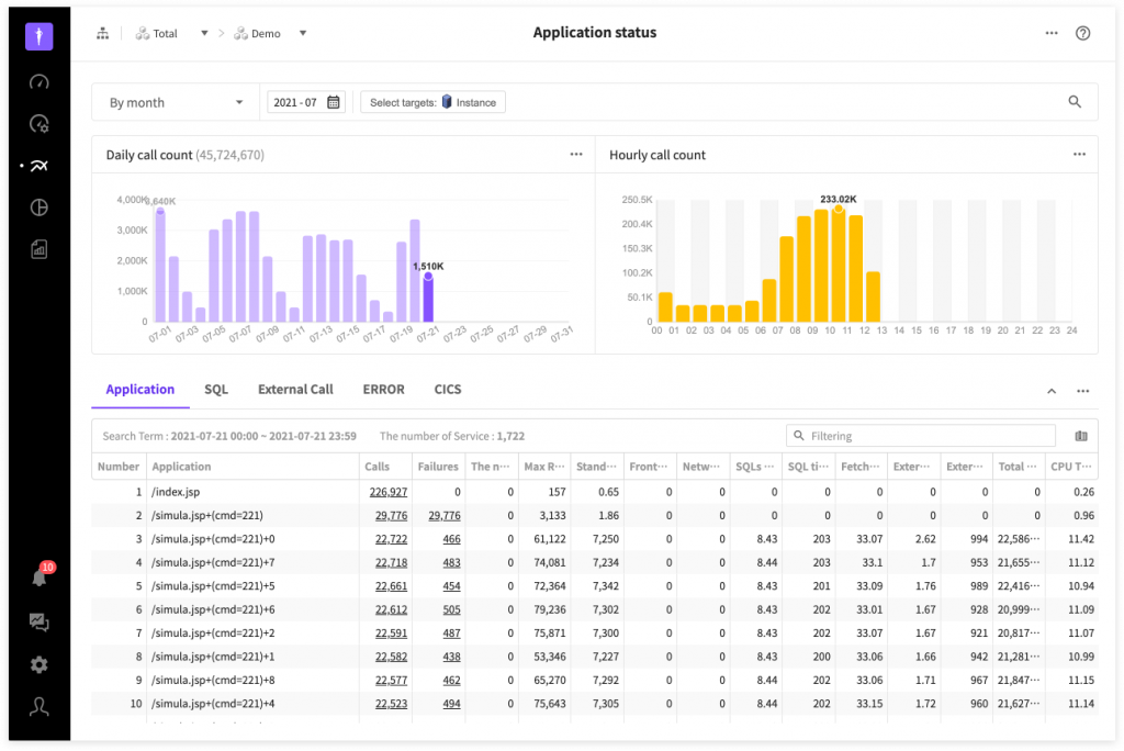
JENNIFER supports the existing resolution of 1280*800, but you all know that the existing layout has a limitation on showing all the comprehensive performance data in one screen. As you can see in the below Analysis > Application Status page when the screen has lots of table columns because the content area is narrow, lots of data are missing, so users might feel somewhat inconvenient.
Thus, we decided to move the location of navigation to the left side in the new layout to create bigger contents areas vertically.
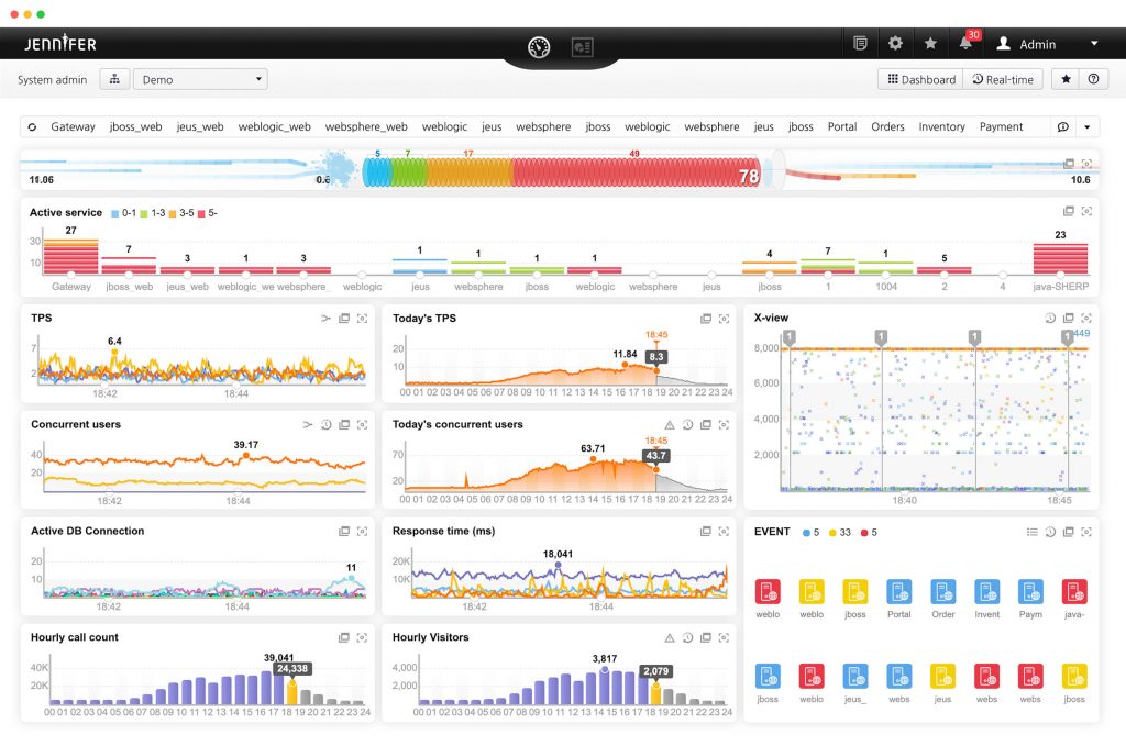
Simpler and more refined, wider and more refreshing!!!! 😊
In the existing analysis/statistic page as well, there were sub-menus continuously displayed on the right side, but in the new layout, they are popped up as layers. Thanks to this, contents areas are expanded horizontally as well.
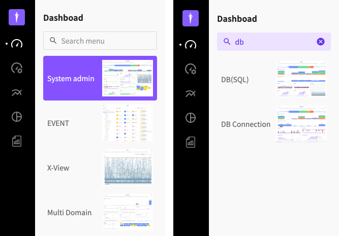
Menu list expressed as layer
If you click the navigation menu icon, the sub-menu images will be displayed as layers and sorted by the order of frequency of visit. Click the menu that you want to use. You will be directed to the page. If you are a user who visits a specific menu frequently, then the menu is displayed on top, so you would no longer have to search hard for it 😉 For your information, you can be immediately directed to the pages of user-defined dashboards or reports.
In the menu search field, you can search and filter by menu names.
In addition, each menu and its sub menus in layer structures became more intuitive and less clicks are required when moving between menus. Of course, overall user experience is improved as a result.
For example, in the past, to visit Statistics > Daily System Status,
you had to click a total of 3 times: ‘Analysis/Statistics’ → ‘Statistics’ → ‘Daily System Status’ .
But in the new navigation structure
you just have to click twice to move to the desired screen: ‘Statistics’ icon → ‘Daily system status’ . It is much more simple and easy to move.
Alrams
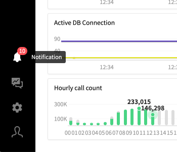
If you click the alarm icon, you can see the layer and the real time updates of alarms. The number in the icon means the total number of alarms that have not been read.
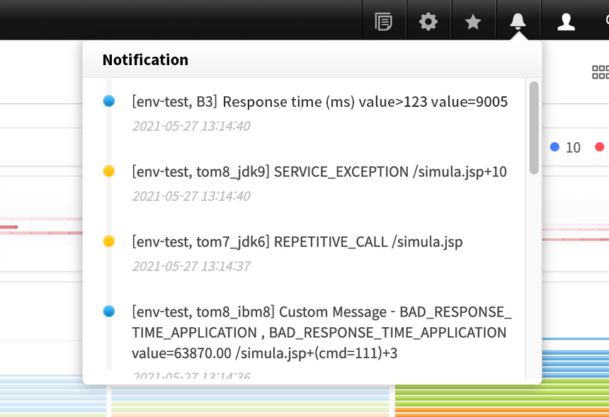
The existing alarm confirmation window has limited space with low visibility and other factors that can degrade usability. To improve these problems, the layer area is broadened as much as the view port height and the overall alarm box size and font size are increased.
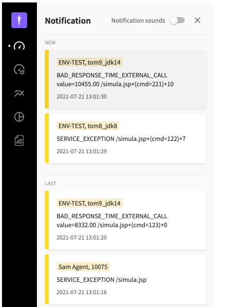
‘NEW’ and ‘LAST’ in the layer show alarms that are read and not read.
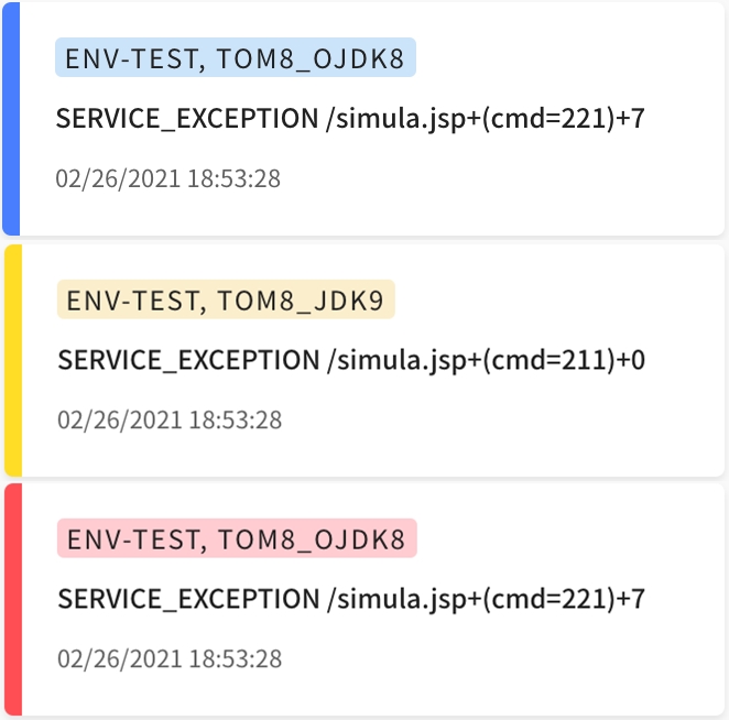
Each alarm has a different color depending on severity, in other words, three steps of Normal → Warning → Fatal. You can click the alarm with problems to check the detailed message and also click the transaction relevancy analysis button to launch the transaction analysis pop-up window.
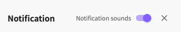
In addition, you can toggle the alarm sound switch to turn the alarm sound on or off in the layer. Besides, on the newly added setting screen, you can check detailed settings such as the total number of alarms stored, desk top push messages and so on.
New setting screen
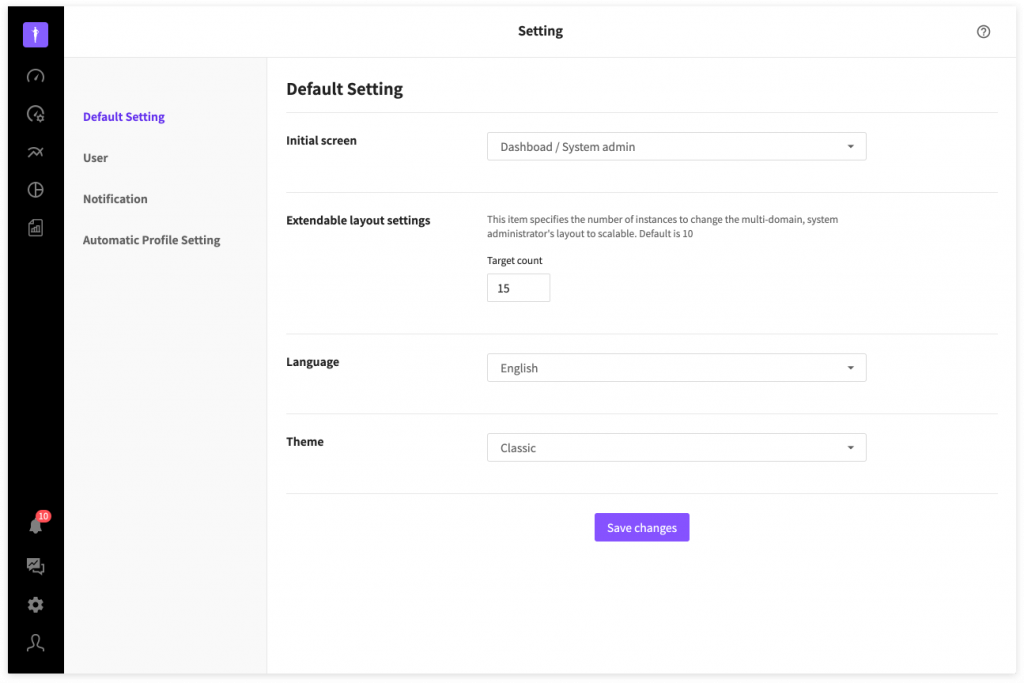
If you click User Menu > Setting, you will be moved to the new setting screen. On the left navigation menu, you can set basic stuff such as theme, and languages and set user accounts and alarms and so on. You can click the Save Change button at the bottom to save changes.
User menu
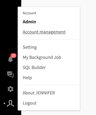
You can click the user menu icon to view the user account information and other sub menus as follows.
So, what is your impression on the new Jennifer layout? Do you find navigation changes, menus and alarms more simple and refined than before? 😃 In the next article, we will tell you more interesting stories about the new design system and brand color of JENNIFER 😘
