Renewal of Jennifer Color Style Guides

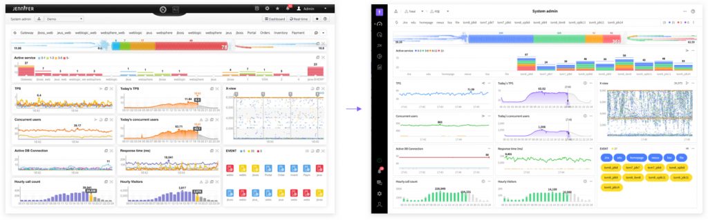
While proceeding with the Jennifer renewal project, we also got involved with tasks to change the colors of screens and charts, in other words, the Jennifer brand color. Following the changes in the navigation, it must be the critical change that catches the attention of everyone.
The task involves the selection of suitable colors for the new screen design and consistent application of them to components, charts or events. Also, it involves classification and structuring of colors used suitably for the purpose of use, in order to facilitate more systematic management. In Jennifer 5.6.0, you can expect Jennifer charts with more sophisticated and nicely arranged colors compared to the existing brand colors.
In Jennifer 5.6.0, you can expect Jennifer charts with more sophisticated and nicely arranged colors compared to the existing brand colors.
Use of Jennifer Brand Colors in More Simple and Sophisticated Ways
Due to the absence of specific style guides or standards for using colors, developers had to rely on their instinct when creating a new screen or encountering a case of exception. As we had to produce the necessary color each time, we ended up with lots of similar colors with no specific rules and had hard times managing them. For this reason, there have been lots of difficulties in selecting a brand color to deliver delicate emotions.
While proceeding with the Jennifer renewal project, we decided to renew the brand colors in order to facilitate a more smart and sophisticated expression of JENNIFER’s brand image on the new Jennifer screen.
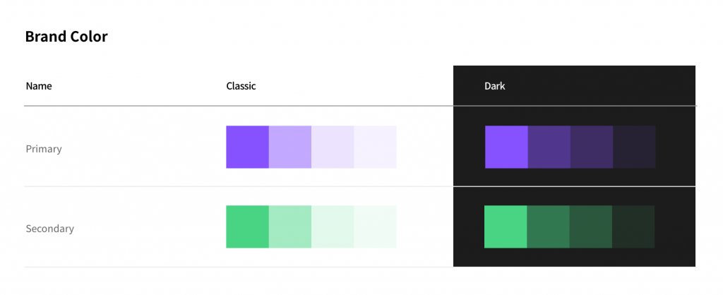
First, we selected new colors and applied only different brightness to brand colors designated as primary and secondary colors. As a result, necessary emphasis was made under the same color tone. The purpose of the arrangement was to avoid interference with users in detecting data which is the most critical aspect in data analysis.
Renewal with Simplicity and Consistency by Differentiating Detailed Information
JENNIFER has lots of charts illustrating events in many different places. There have been lots of similar colors indicating similar ‘Status’.
That is because we failed to systematically prepare event colors and we added new colors each time a new screen was needed while the color management system was absent. Including the cases of colors with gradation, we can expect that so many more similar colors have been used. Renewal work was an urgent issue.
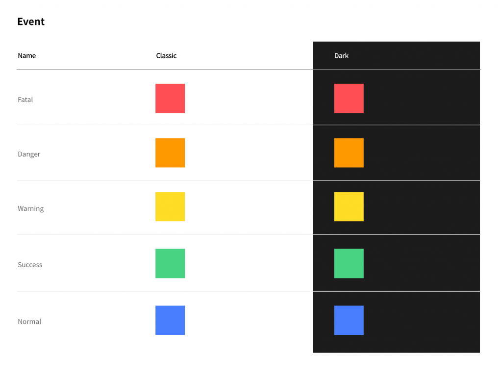
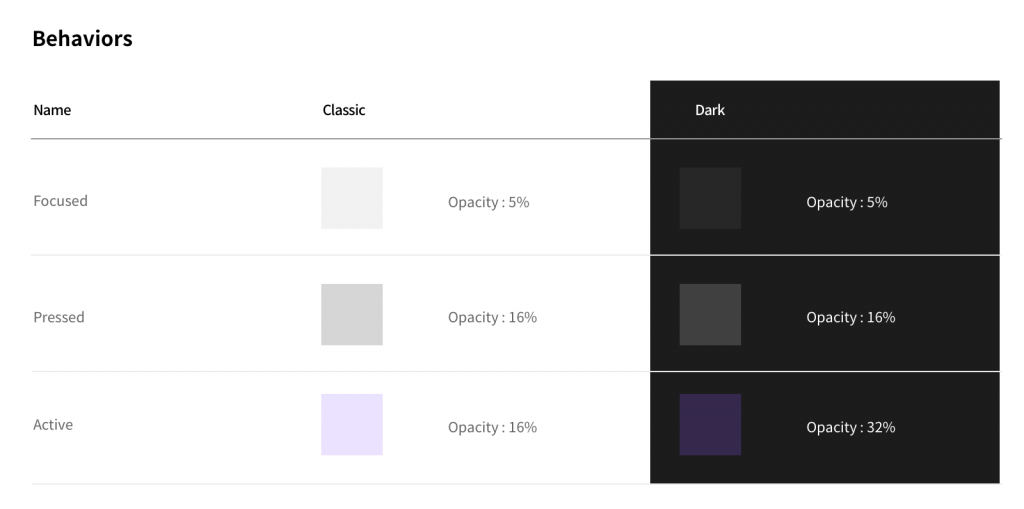
First, we merged colors for a similar status and made it look more simple in the overall context. Also, we classified colors resulting from the pattern of behaviors and layered them accordingly for use, in order to reduce the range of colors. We proceeded with the manual write-up to facilitate easy management in the future.
As the manual is nicely arranged, we expect that our works will be much easier from now on
Stylish Chart Color Change
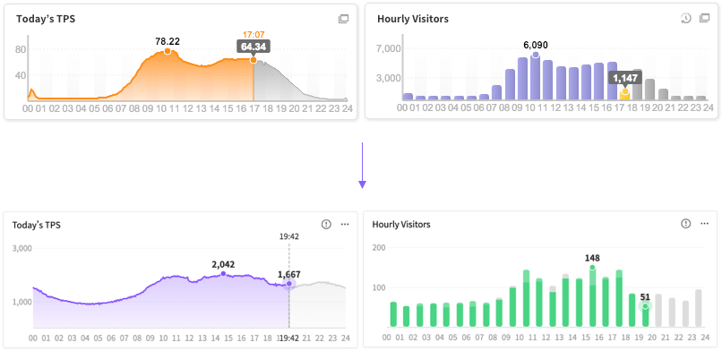
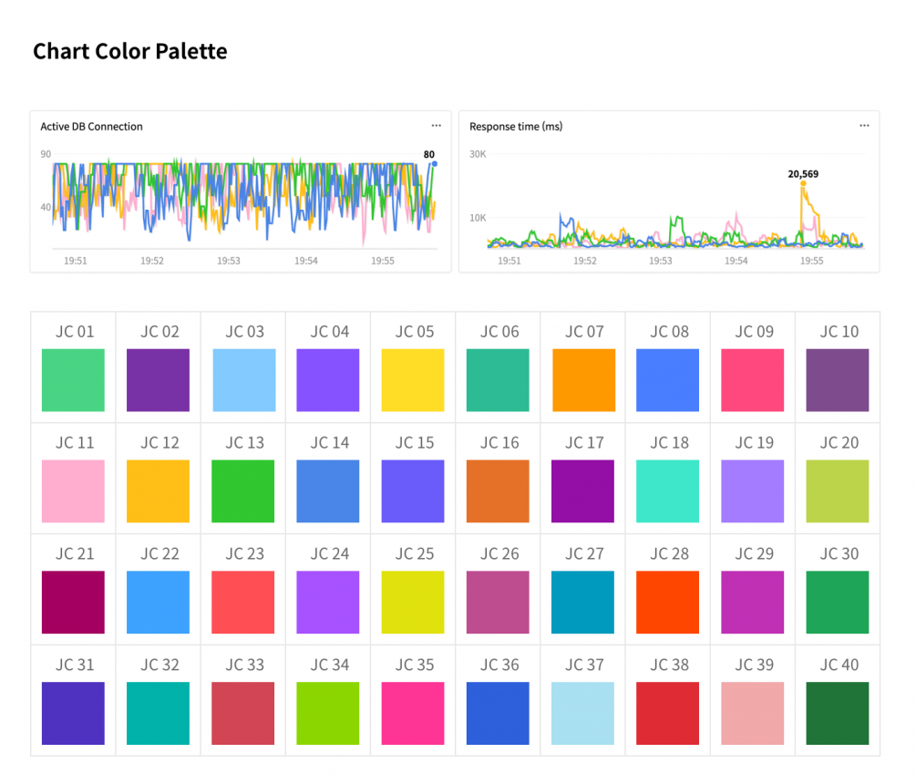
In this renewal, we made critical changes in the chart color pallet. We proceeded with tasks to convert chart colors to more clear and visible ones. In general, except for the event colors, Jennifer chart colors are mostly used in line charts and lots of our customers have several dozens of instance colors, we must provide as many colors as possible.
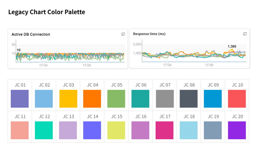
In the past, in addition to 20 colors, a new color was created with color value codes if there were more than 20 sets of data, now, it has been increased to 40 colors by adding 20 harmonious colors.
Despite lots of changes, not all the screen designs have been renewed, so we will continue our works to simplify them during the second half of the year.
Expect much more sophisticated and stylish changes in the next article
